
Driving Success for 100+ Agencies in a $3 Billion Market Through Kudos Travel’s Award-Winning UX
The Product - Live
Kudos Travel is an award-winning all-in-one corporate travel platform that streamlines workflows—from approvals to real-time updates and credit tracking. With modular design, secure data, and AI assistance, it modernizes travel for 350+ companies like McDonald’s and MYOB.
The Problem
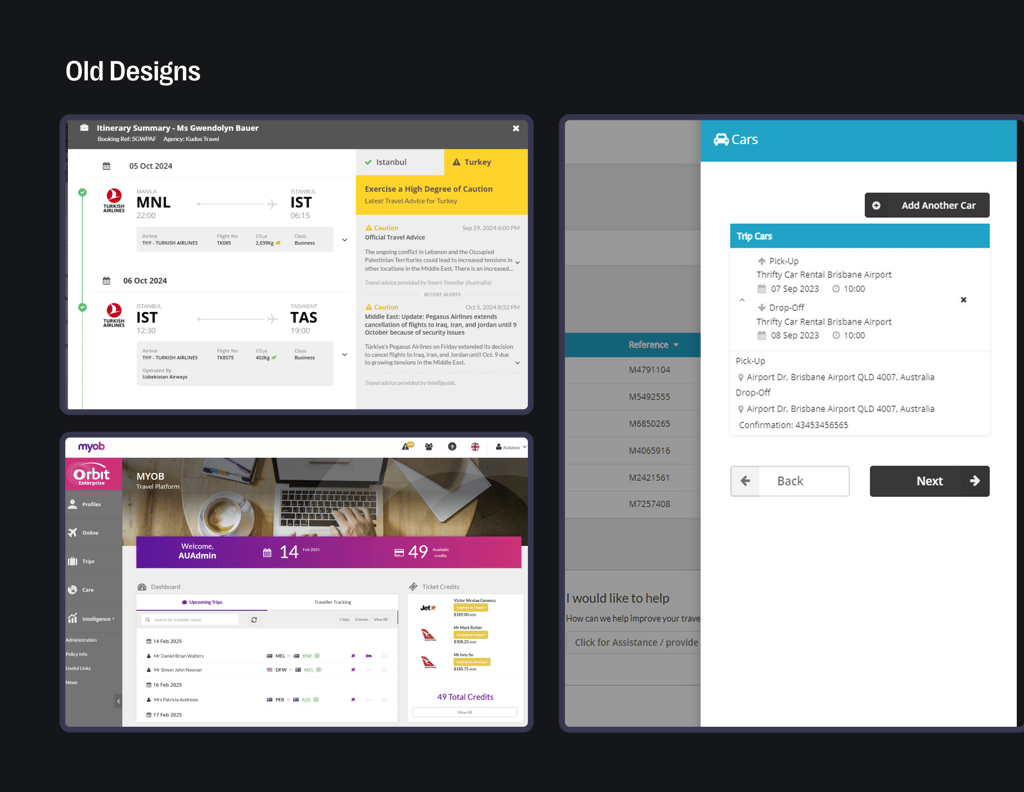

🔴The Main Home Page dashboard was visually outdated and cluttered, failing to deliver clear, actionable insights needed for quick decision-making by hundreds of users.
🔴The Travel Requirement UI, critical for compliance and policy adherence, was confusing and difficult to navigate, increasing the risk of errors across thousands of travel plans.
🔴The Travel Alert system was outdated and backdated, resulting in delayed notifications that put thousands of travelers’ safety and compliance at risk.
🔴The Profile Creation from Passport data was cumbersome, leading to onboarding delays for thousands of users across client organizations.
I was hired on Upwork as a Lead Designer, responsible for designing the entire mobile app. Goal was
MY Task
🟢Modernized the Home Page Dashboard for clearer insights at a glance.
🟢Improved the Travel Requirement UI to support policy compliance and usability.
🟢Redesigned the outdated Travel Alert system for real-time, actionable notifications.
🟢Simplified Profile Creation from passport data for faster onboarding.

Solution & Final Design
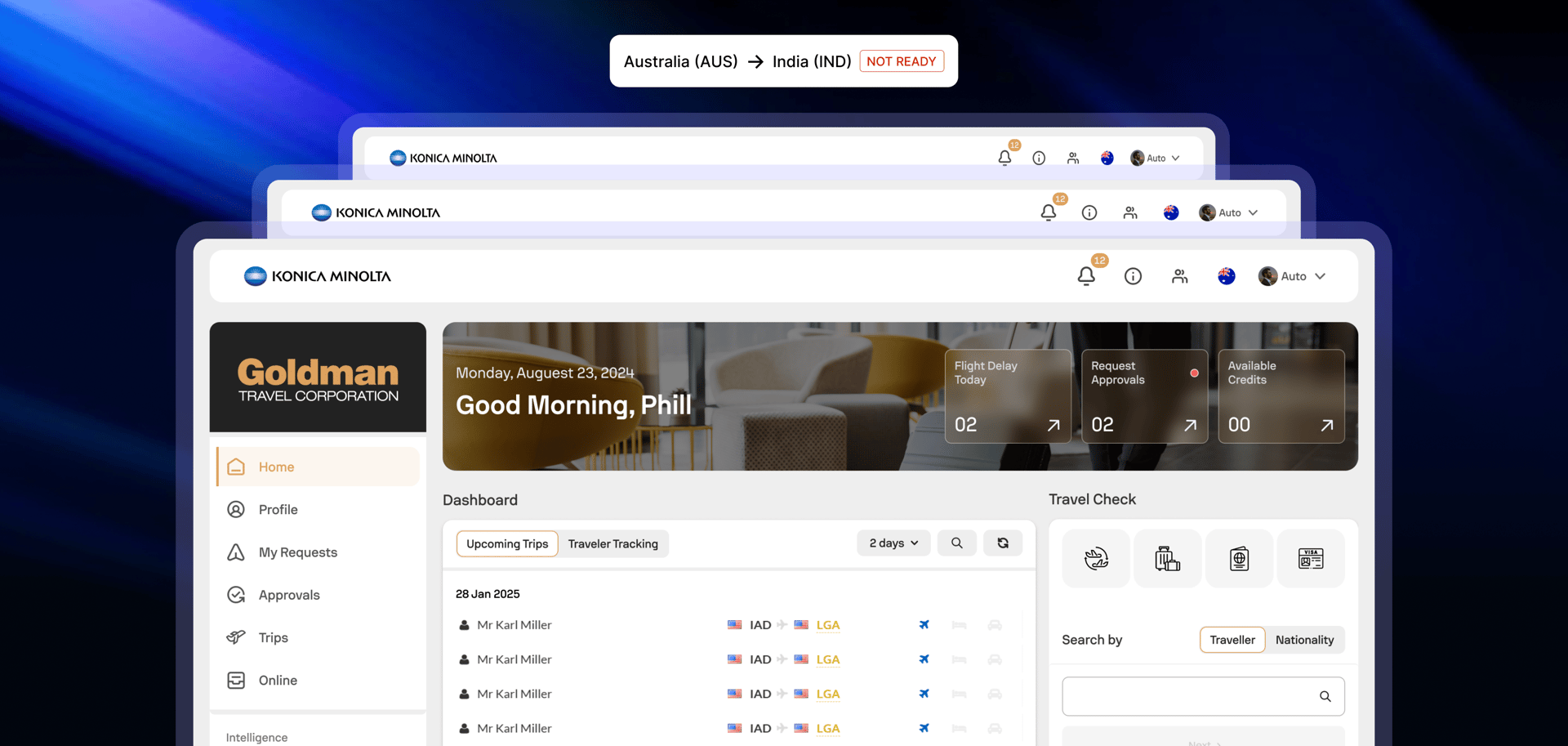
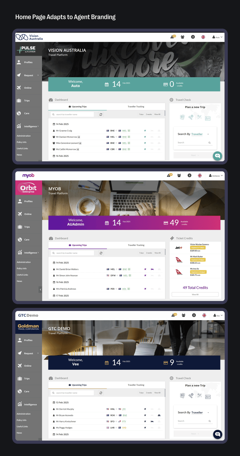
[01] Home Page Redesign

The old Kudos home page was visually outdated, rigid, and lacked brand flexibility. Every client saw the same generic interface—no customization, no personality. It didn’t reflect the scale or quality of the product experience.
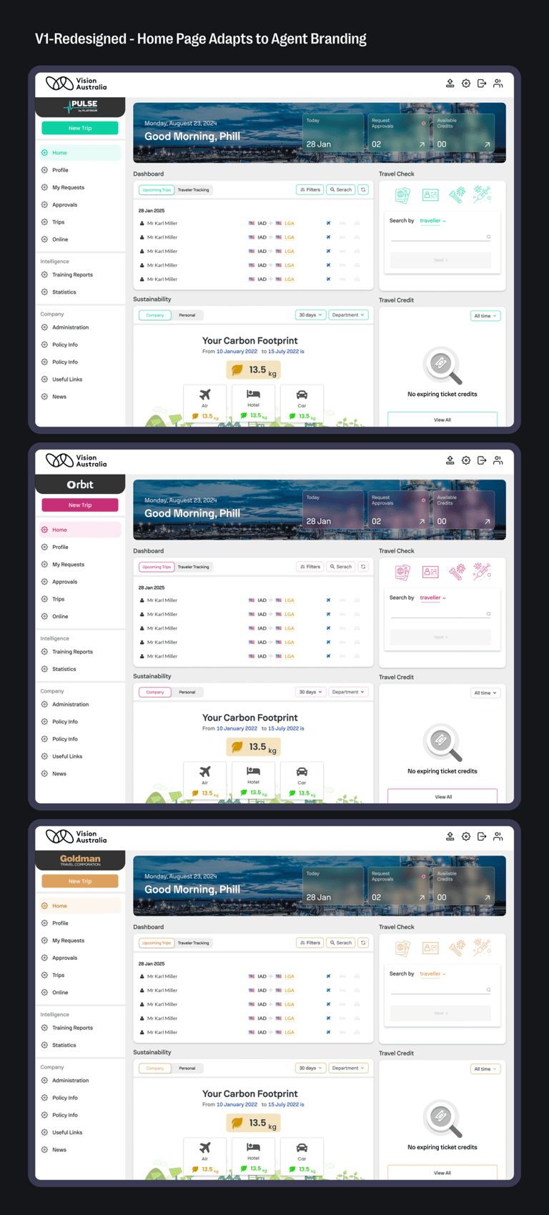
↪ 1st Iterations
The goal was simple: find direction. Early designs focused on layout structure, key features, and brand flexibility. It wasn’t about polish—it was about nailing the foundation and making sure we were solving the right problems.
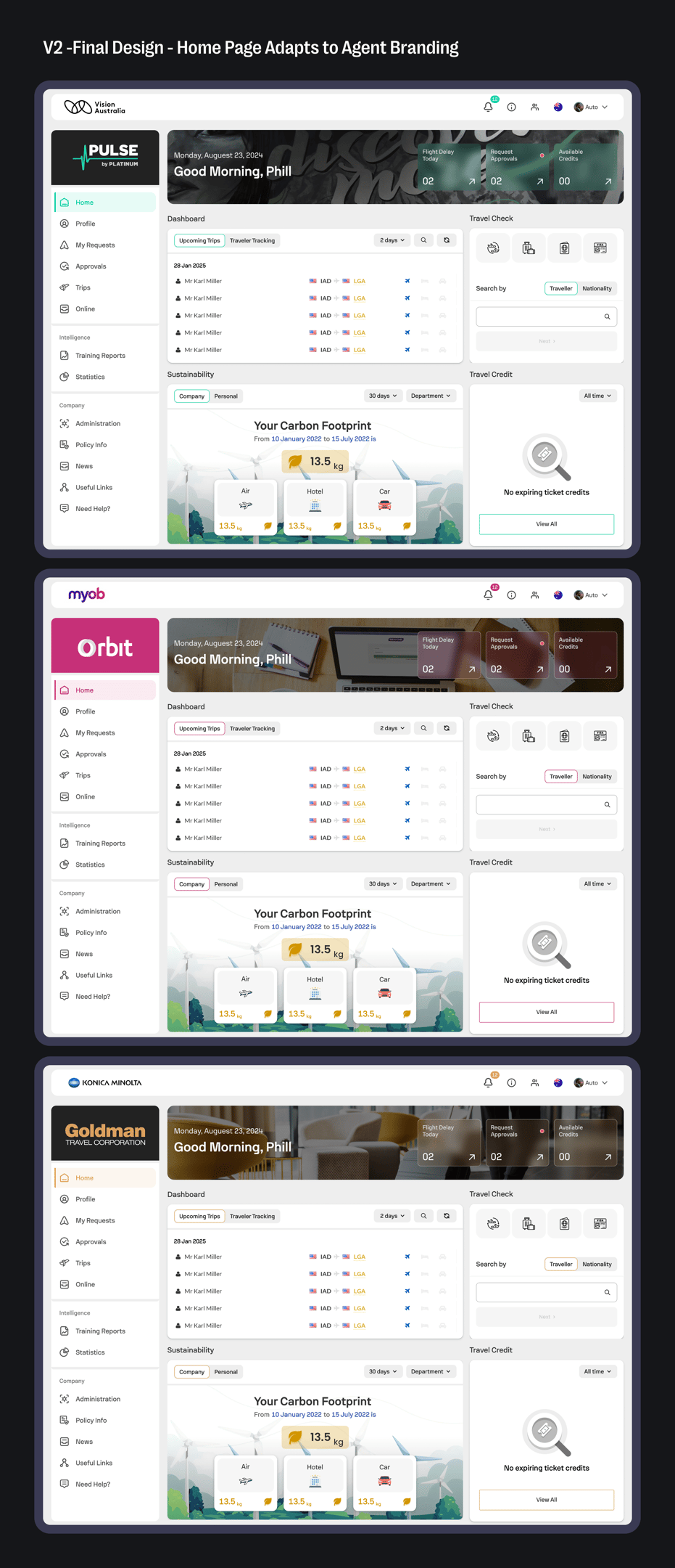
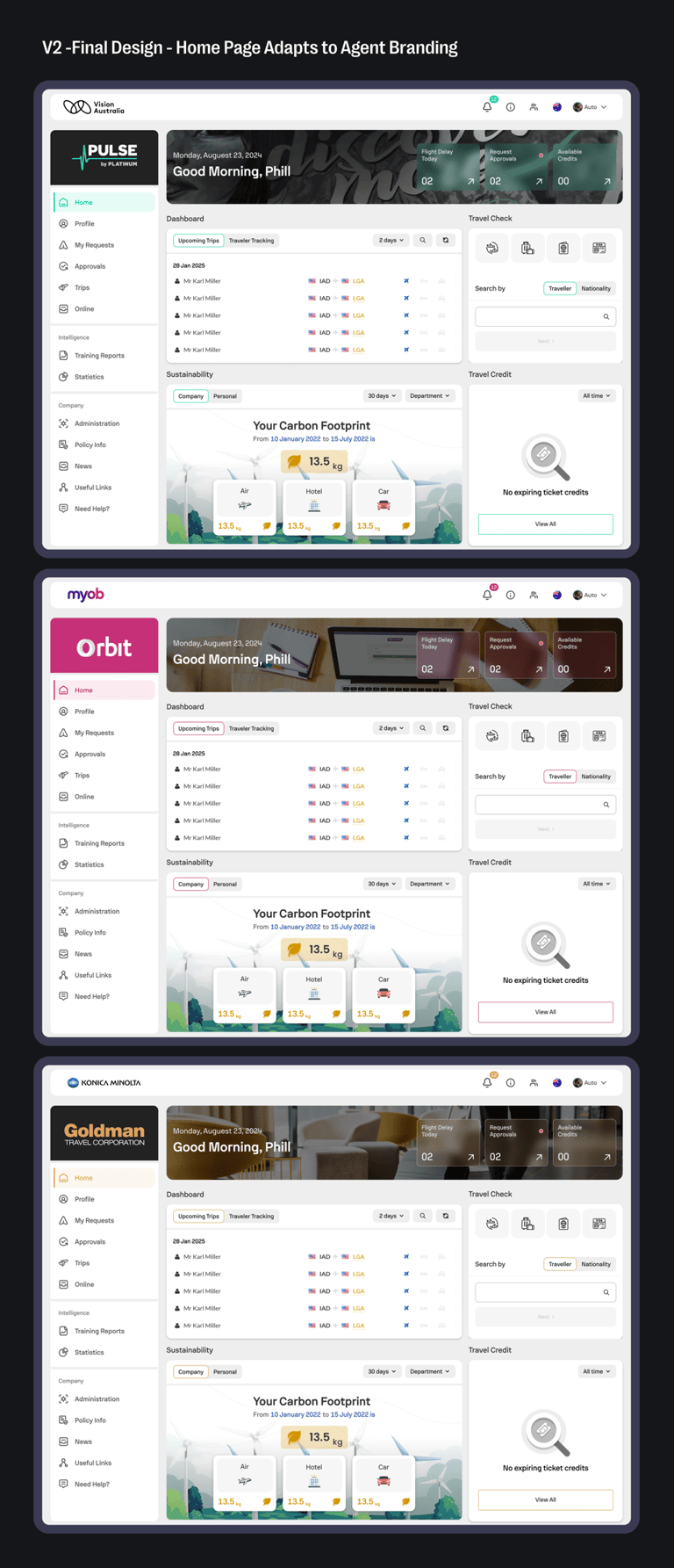
↪ Final Design
After client feedback, we refined the direction and locked in a clean, branded experience. Post-launch, travel agents appreciated the clarity and flexibility—this version just felt right.

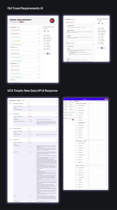
[02] Travel Requirement UI
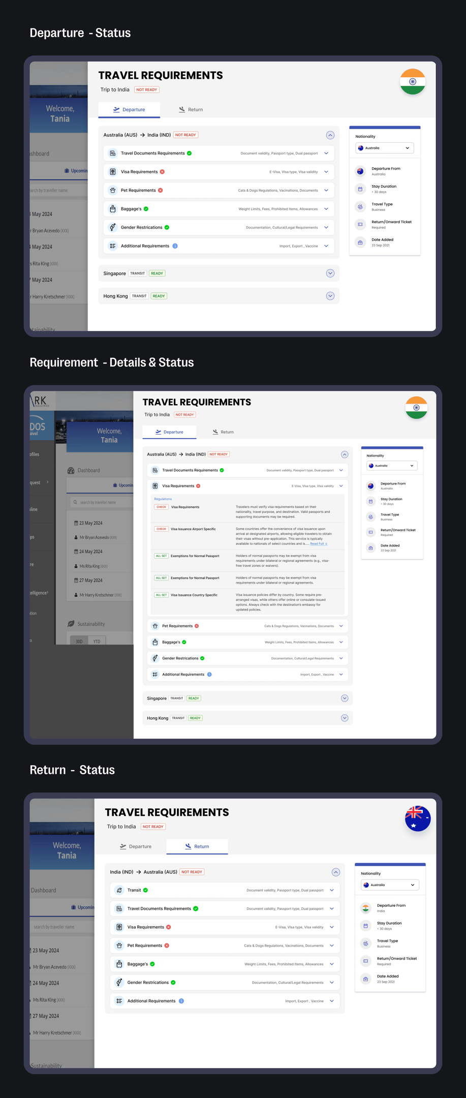

With IATA’s new API delivering real-time travel rules, the old UI just couldn’t keep up. We redesigned it to handle complex visa, entry, and return ticket requirements—giving users accurate info before booking. It’s the upgrade every travel platform needs.
↪ Final Design
Built on the new IATA API, the updated UI consolidates all travel requirements—visa, return tickets, entry rules, and a dozen more—into one clear, checklist-style interface. Users can instantly see their entire travel readiness at a glance, with no guesswork, just straightforward clarity.
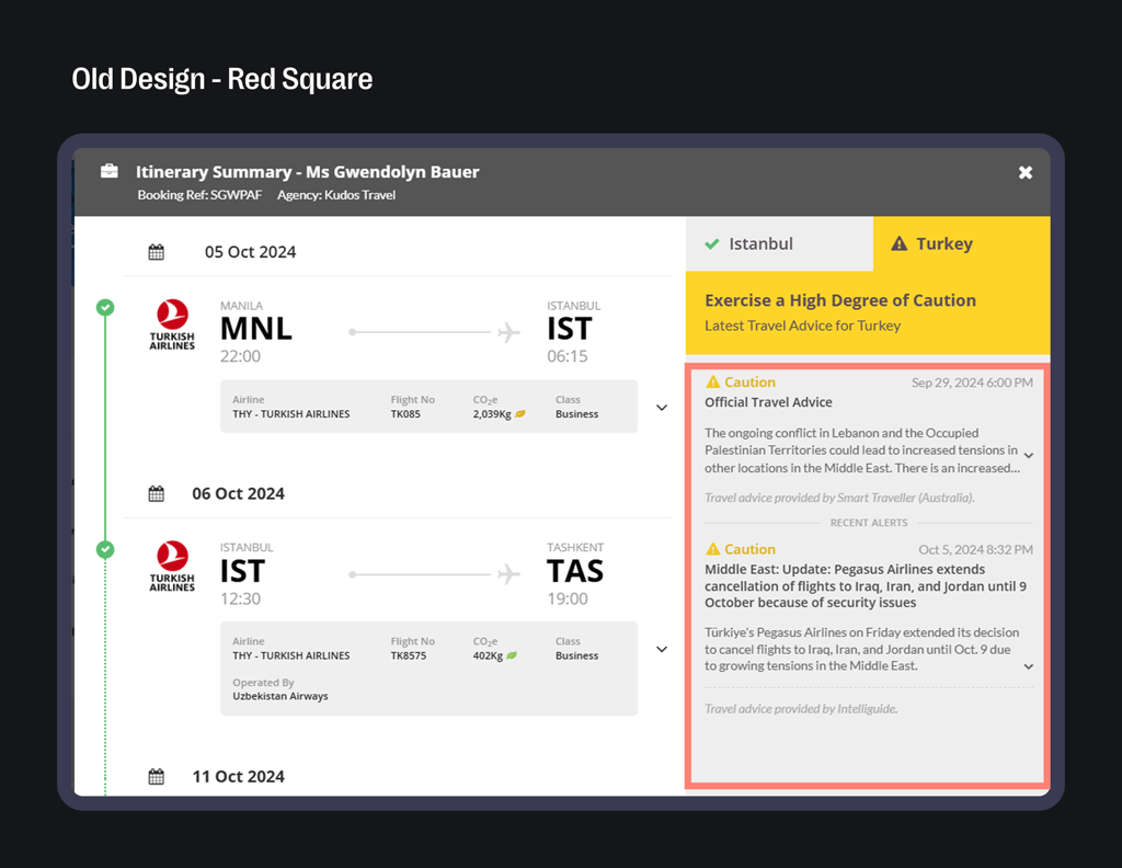
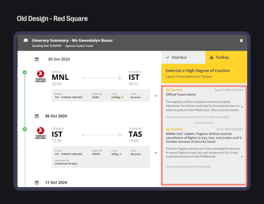
[03] Travel Alert UI
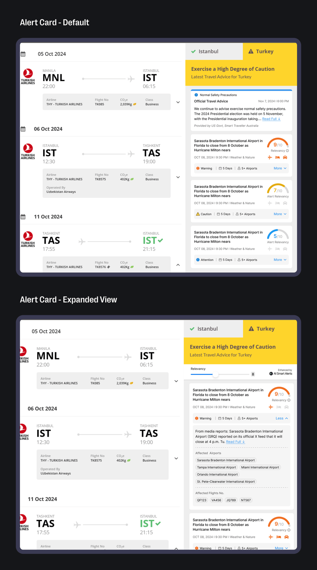

Right now, Travel Alerts show both relevant and irrelevant info—even things users don’t need. Important updates like political unrest, extreme weather, or health outbreaks get buried. We’re redesigning it to show only destination-specific, high-impact alerts. Less noise, more clarity—so travelers get the right info at the right time.
↪ Iterations

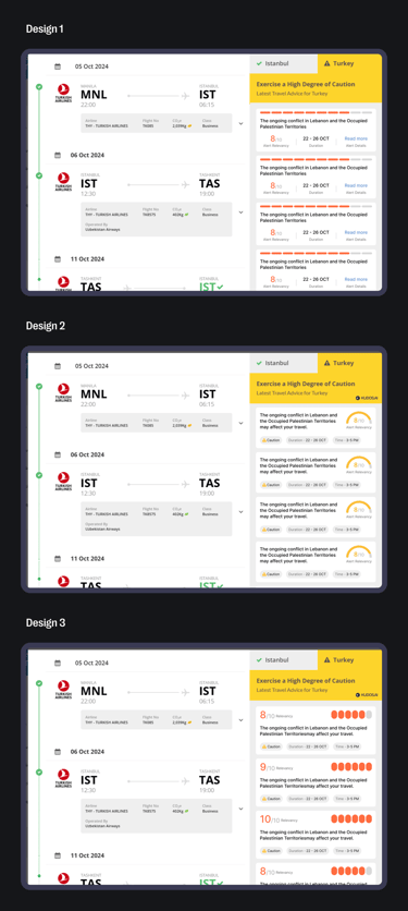
↪ Final Design
We introduced a Relevancy Meter (1–10) to rank alerts by importance—10 for serious warnings, 7 for caution, 5 for attention-level updates.
Users can now quickly assess risk and take action accordingly.
Each alert card is expandable, showing affected areas, airports, and how long the alert is active.
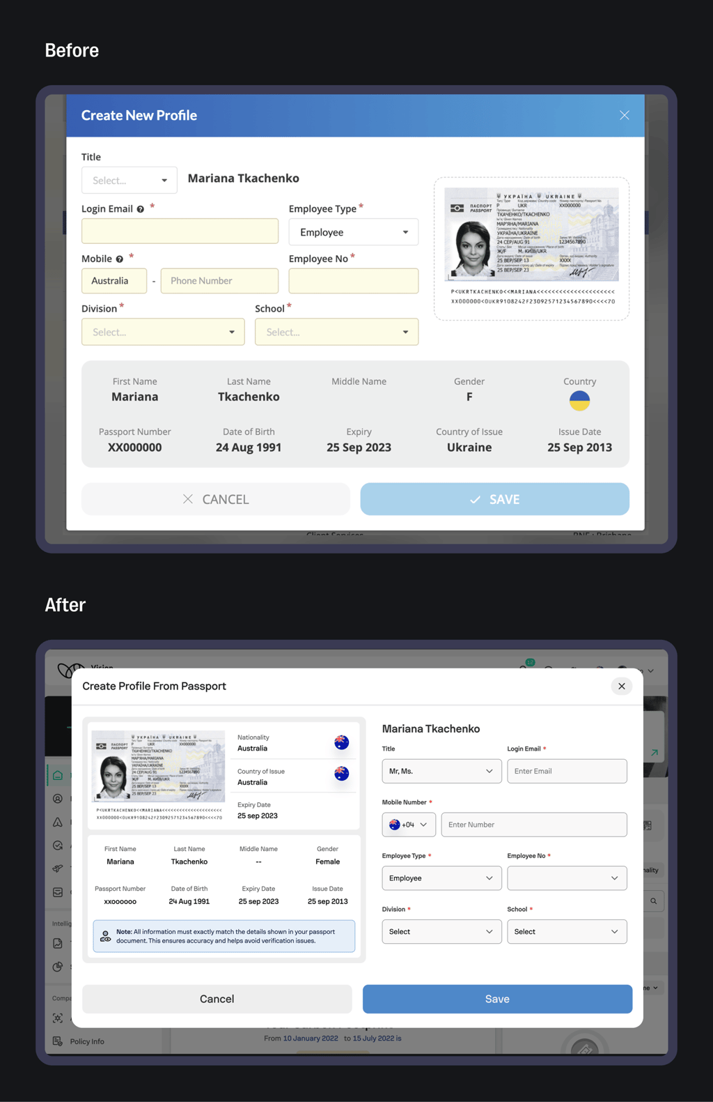
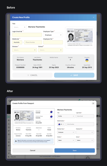
[04] Profile Creating From Passport
The old UI was unclear and confusing, making it hard for users to complete their profile. We redesigned it with a clear, step-by-step flow to guide users smoothly through the process. The before-and-after page highlights how much easier and more intuitive it is now.
Project Outcomes
🟢The new Home Dashboard was widely appreciated by travel agents for its clarity and modular layout, leading to quicker task completion.
🟢Travel Requirement UI redesign reduced confusion, with a noticeable drop in booking errors.
🟢Real-time Travel Alerts boosted engagement by 2.5×, helping travelers respond faster to disruptions.
🟢Onboarding time was cut by nearly 25% after improving the passport data flow.
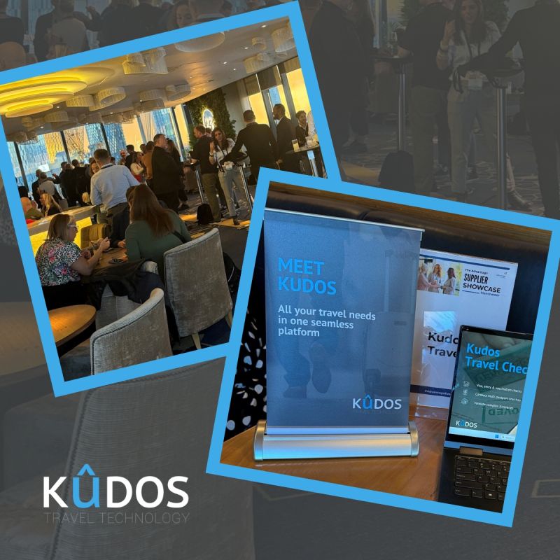
🟢The redesign was highlighted at a major industry conference, earning praise for its clean structure and enterprise-friendly experience.
What I Learned
🟢Simplicity sells — even complex platforms convert better with a clean, focused design.und user flow logic
🟢Real-time alerts need to be seen and acted on, not just sent — timing is everything.
🟢Small UX decisions build big user trust — and that trust drives adoption.
🟢Understood the value of testing early and often
🟢Great design isn’t just shown, it’s sold — presenting live taught me how to pitch outcomes, not just pixels.
Next Project